Where to Buy
Partnership with Crain's Chicago Business
A tool to score, sort, and filter real estate in Chicagoland neighborhoods based on a variety of statistics.
Helping Crain’s readers decide where to buy
Where to Buy is a collaboration between Crain’s Chicago Business and DataMade to help Crain’s readers find the right Chicagoland neighborhood based on their needs. DataMade worked closely with Crain’s reporters to prepare the data for the app and design the UI interactions in way that fit the needs of Crain’s readership.
DataMade scored places based on five variables of interest:
- High diversity
- Good schools
- Low crime
- Solid real estate price growth
- Short commutes
Users can rearrange the variables to reflect their own personal priorities and get an updated neighborhood recommendation. They can also select from one of a few preset profiles assembled by Crain’s reporters.
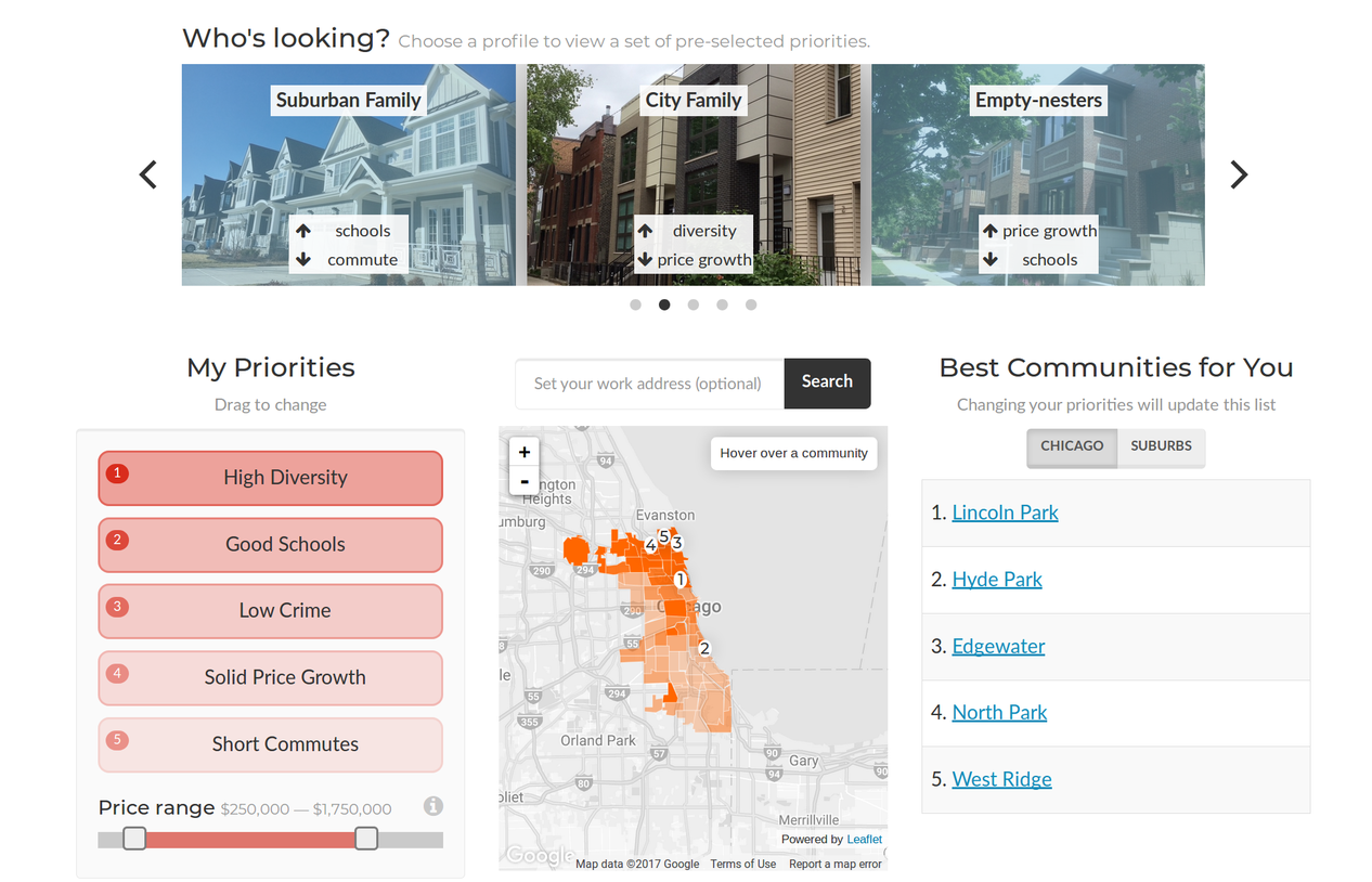
The main page for
Where to Buy
.
Selecting a specific place shows an overview, including a brief summary from Wikipedia and a detailed breakdown of how its scores compare to surrounding neighborhoods.
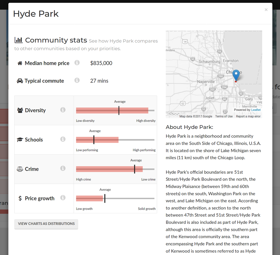
Detailed information for Hyde Park, on Chicago's South Side.
An extensive data pipeline
The data preparation pipeline that DataMade built for Where to Buy collects, cleans, and analyzes information from a wide variety of sources, including:
- Scraping PDF reports of real estate prices and transforming them into structured data
- Inferring stats on racial diversity and commute times using US Census data and the Google directions API
- Linking crime stats from the Illinois State Police’s Uniform Crime Reports to jursidictional boundaries
- Scraping short descriptions of towns and neighborhoods from Wikipedia
- Scoring towns and neighborhoods across the five variables of interest using Principle Component Analysis
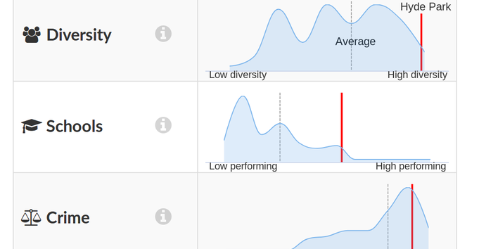
DataMade designed UI components to allow users to explore and compare the data at the highest possible degree of precision. When comparing a neighborhood’s scores to the scores of other neighborhoods in the wider region, for example, a user can switch to a distributional view to see the spread and shape of scores across that region.
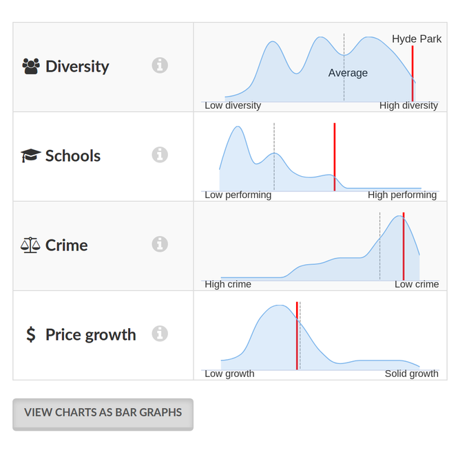
Hyde Park's scores, compared to the distribution of scores among all
neighborhoods within the City of Chicago.
While parts of the pipeline remain closed source in order to respect the privacy
policies of certain data sources, take a look at the data subdirectory on the GitHub
page for
a taste.