Our Process: Building An Affordable Housing Lending Map
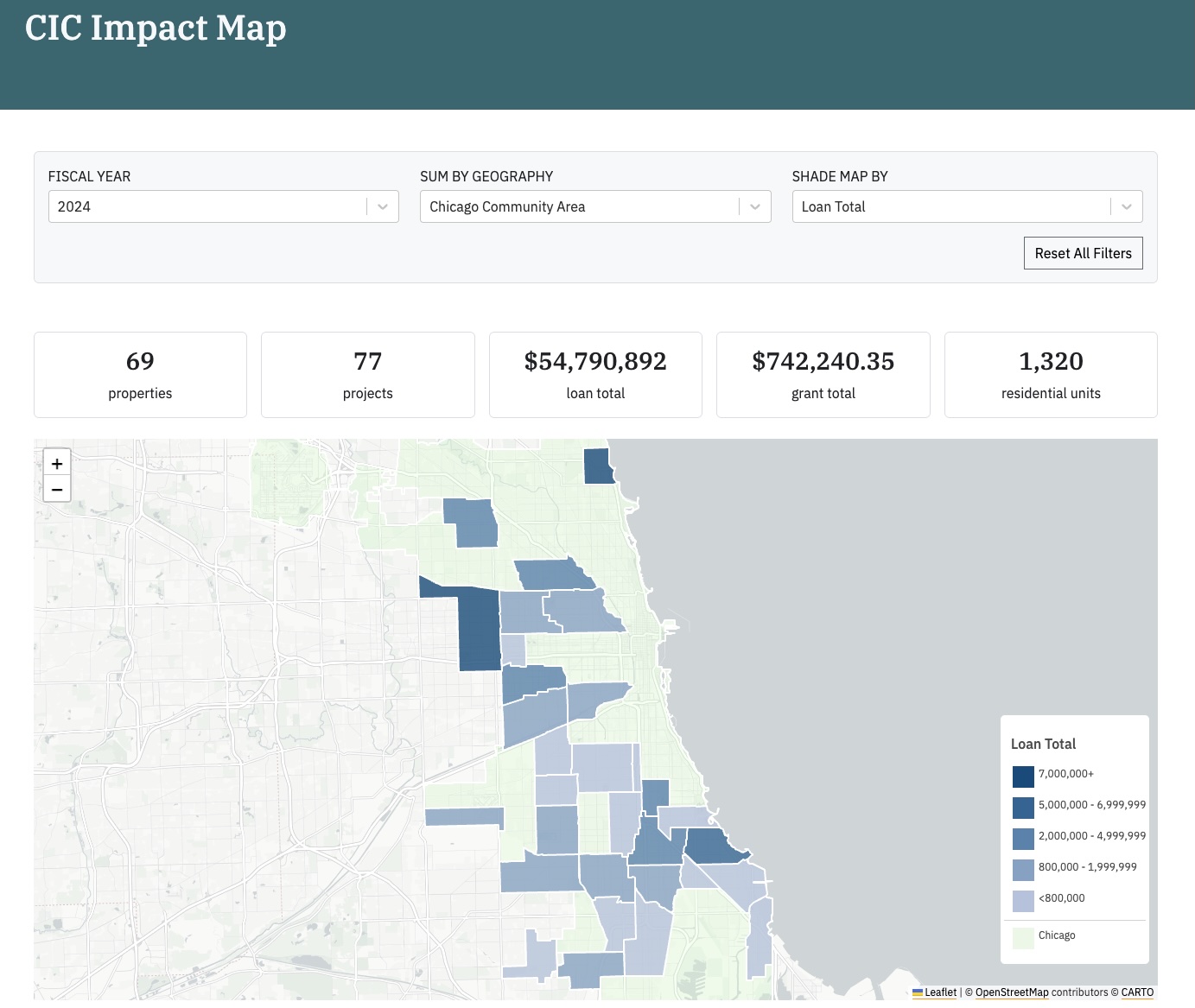
We partnered with the Community Investment Corporation to develop an easy way for them to visualize the affordable rental housing loans and grants they issue. This manifested in an internal map which is populated with real time, interactive data. It also provides a more granular view of the communities, projects, and properties associated with the loans they make.
Published September 04, 2025

Community Investment Corporation's Lending Impact Map
DataMade worked with Community Investment Corporation (CIC), a nonprofit organization that provides financing for the acquisition, rehabilitation, and preservation of affordable rental housing in Chicago neighborhoods and suburban communities. In addition to financing, they also offer customer service and complementary programs and trainings to help their borrowers grow and strengthen their businesses.
Together, we developed an easy way for them to visualize the affordable rental housing loans and grants they issue. This manifested in an internal map which is populated with real time, interactive data. It also provides a more granular view of the communities, projects, and properties associated with the loans they make.
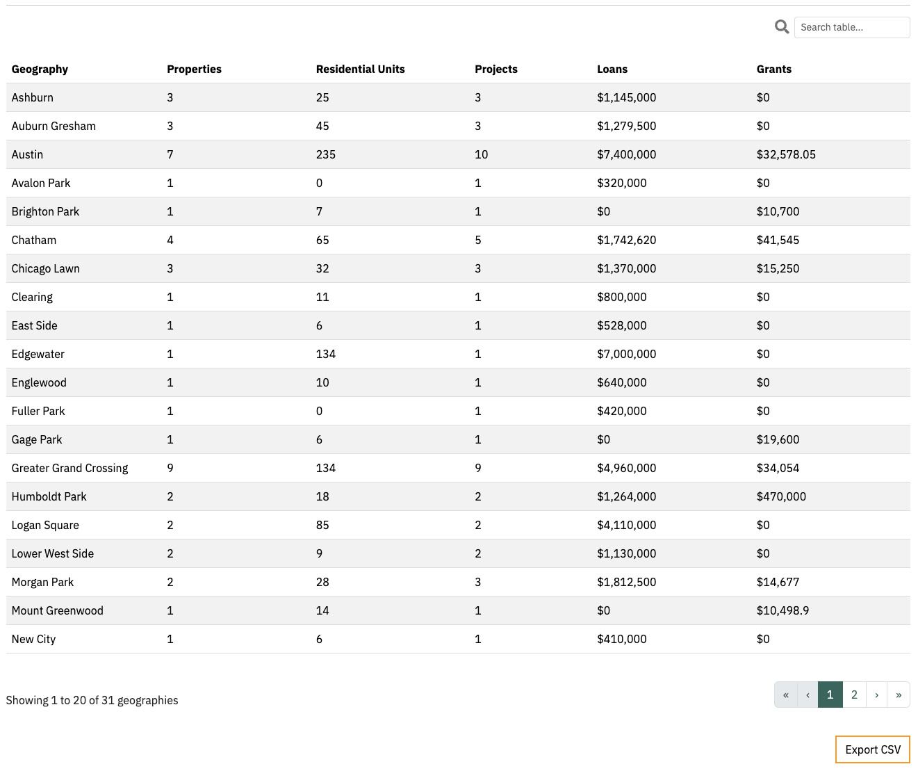
The table on the same page supplements the map with a more structured view of each area's results.
Working with DataMade
Design
The first step we go through on a new project is the Design phase. We start with a kick-off meeting where we get a feel for the kind of tool a client is looking for, and follow that up with a series of standing meetings to keep each other in the loop. These meetings happen on a regular basis that we decide with the client, and serve as a dedicated space to update each other on recent developments in real time. The lean size of our team lets us really take advantage of an iterative, agile development flow. This means we can easily adjust, refine, and deliver on our objectives between cycles - which is great because traditionally, goals and desired outcomes tend to change as the project takes shape!
In CIC’s case, our goal was to dive a little deeper into the nature of their work, get more context on what they’re hoping the map will achieve, and gather some ideas about the things we’ll need to get started. The following standing meetings occurred every two weeks, and were frequently packed with updates and questions on both sides as we proceeded to dig into their data.
After some initial brainstorming, we did some research by reviewing their annual reports, and created wireframes to show a mockup of the map’s user interface (UI). We find that after presenting the first prototype, folks are more empowered to identify what kind of experience they’re looking to deliver. It gives clients something concrete to point to, something to say “I like that this does X”, “what if we added Y”. This gives us some useful guidelines to follow as we proceed into the Build phase.
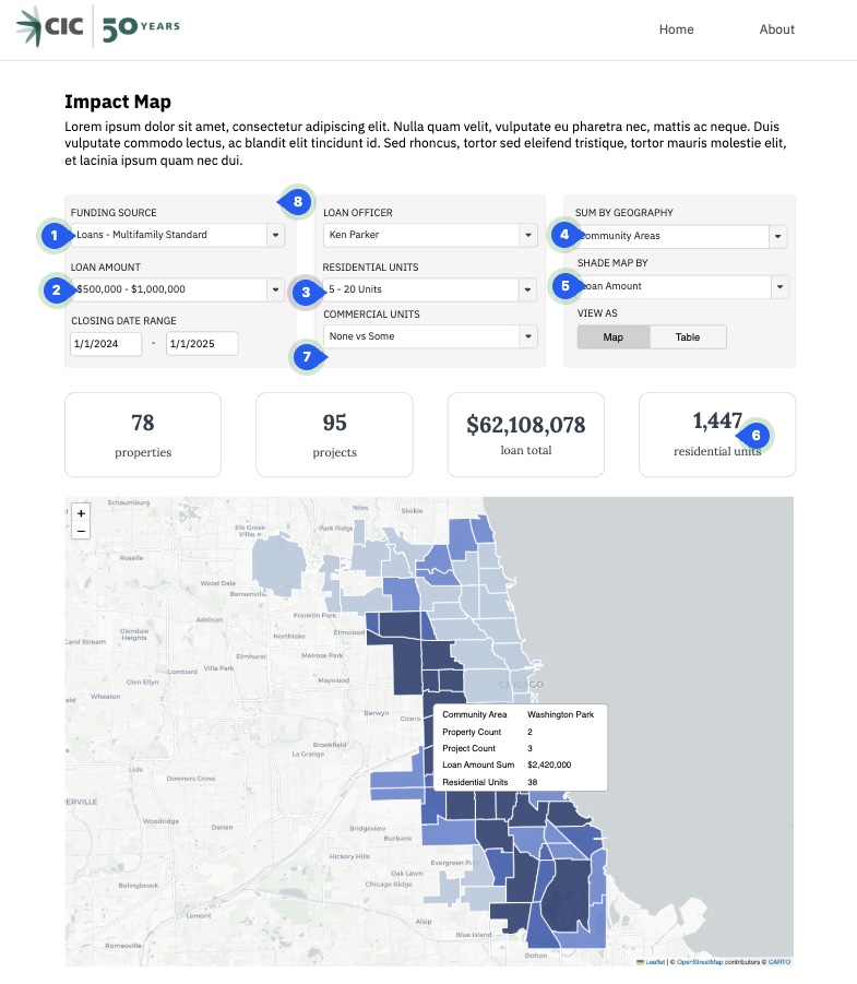
The wireframe of the map during the Design phase.
Build
The Build phase is where the most variance lies in our process, as we tailor it to the client’s specific goals. This will involve anything needed to get the project off the ground, including developing a pipeline for data, automating previously manual labor, scraping information from documents, and more. (You can check out DataMade’s services to see a full list of what we offer!)
This particular project needed an ETL process in order to extract their data from Salesforce, transform it into a geographic data structure that would be usable on a map, and load it into a database for dynamic display on the page. From there, we solidified our ideas about the UI and UX of the site as a team, and created public and private versions of the map.
Launch
As the development process went on, loans were mapped and their Impact Map moved into the Launch phase! Because of the nature of the information that we were working with, our focuses shifted a bit near the end of development. We worked to ensure that the map summarized information as closely as possible to the way CIC’s reports do. CIC meanwhile was able to use the map as an extra tool to check the validity of their data in Salesforce. Today we have a map that is accessible, accurate, easy to use, and delivers information to the people who need it.
Technical Learnings
There are three main areas of interest when it comes to what we learned from this project: investigating the source data within Salesforce, passing data between Django and React, and optimizing our use of Django Object Relational-Mapping (ORM).
Investigating Their Data
Connecting to Salesforce ended up being fairly easy, thanks to a python package named simple-salesforce. We connected to the sandbox instance their contacts at Salesforce set up for us, and played around with the data. We started by querying for all available tables and quickly found that there was a massive amount of tables that had little to do with what we were trying to achieve or were mostly empty. In order to narrow down the tables that might be relevant, we wrote a script that listed every table with at least one record. From there it was a judgement call by the client on which tables with records to investigate. Does the name of this table seem like it may contain data we’re interested in? If yes, what kind of data does it contain? Does this table stand alone, or is the data within indicative of a relationship between two objects that we weren’t aware of?
Connecting Django To React
Once we were able to make some decisions on what data we’d like to show, then came the question of how best to serve up that information from Django to the React components that would render our maps. There’s plenty of discussion online on different ways to accomplish this (we’ve even got some discussion in our own repos), and in the past we’ve employed a pattern of sending a template context variable from the backend and assigning that to a JavaScript variable in the frontend, before ultimately using that variable in React components.
For this project, we tried building out application programming interfaces (APIs) and serializers using the Django REST framework which worked out quite well. By the end we had a couple endpoints, one of which was responsible solely for filtering the properties based on user input. This made debugging and implementing the filters quite smooth, since we had an easy way to see the isolated responses from our API and we could just use fetch in our React components to pass new urls to the endpoint whenever we wanted a new set of results.
We also employed some gzip compression to cut down on the size of the data that we’re sending. Gzip compression is a lossless compression algorithm used to minimize the size of data on a server right before it’s sent to a web client, where it will be unzipped. This can dramatically speed up the transfer of data, use much less bandwidth, and reduce the size of files by 70-90%. In our case, gzipping went a long way to making the map run as smoothly as possible.
Optimizing Use Of Django’s ORM
Lastly, figuring out how to optimize our queries when performing the actual filtering was a great learning experience. Django’s ORM is understandably complex, and provides plenty of ways to access the data you’re looking for. Once we got access to the full dataset of well over a thousand projects, we quickly found that we would need to do some optimizing to prevent filter changes from taking minutes at a time. We were filtering individual properties that were connected to funded projects, which themselves were connected to separate funding sources. So we got to work on finetuning our filter prefetch calls - and even filtered within them - to account for all the different models that the detailed filters applied to.
In Summary
With a dataset as expansive as CIC’s we’re glad we took the steps we did to make sure the experience of using the maps was as responsive and zippy as possible. And learning more about the tools we already regularly use and testing out some potentially preferred practices is always a great side effect.